3 min read
Replace two procurement tools with one custom system from a handover with documentation nobody could fully trust.
Stakes
A 100-page requirements doc on day one. Documentation that was already out of date. A client who was rarely in the room.
The client was running Precoro and Procore. Both had gaps they couldn't customize around, and paying for two tools was costing them too. A custom ERP only made sense if one system could replace both across every role. If the design couldn't hold that, the client kept paying for two tools.
Constraint
One month to design.
A previous designer had left a UI baseline and part of the flows, and I took over as the only designer. I was new to construction and procurement. Even approving a design or a concept took the client two to three days to answer. For that long, there was no way to know whether it was right.
The decision
The UI baseline was already there, and it could have been better. But the UX logic was so heavy and so connected that no time or creative energy was left for UI. I made the call to let the UI go, put everything into the UX, and get a precise system live as fast as the client needed. UI refinement waits for version 2.
Within the UX, the Admin Panel came first, not any single module. Permissions, patterns and role logic were set once at the top, and every role-specific screen inherited them, so nothing needed fixing later. After that came the order of the work: Tender, Project, Budgeting.
With the docs out of date and the client slow to answer, I made the backend developer the source of truth. She knew how the system really worked and closed the gaps the documents couldn't.
Every approval took the client two to three days, and there was no time to wait. So the next flow started before the last one was approved. The earlier flow stayed unconfirmed, and I accepted the risk that it might change, to save the time.
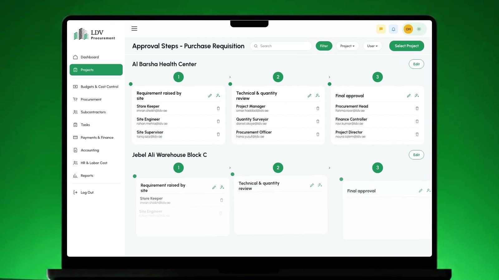
The mistake
I skipped mapping how the modules connected, because it felt slow. Soon nobody could follow how pages linked, the developers included. Flow diagrams and a walkthrough with both teams fixed it.
Trade-off
UX logic won over UI polish, which left version 1 on a UI that could be better. That was accepted because the client needed the system live fast and the flows had to be exact.
Outcome
The design was done in about three weeks against a one-month plan. The client's feedback at handoff was that it gave their teams a clearer way to move through the system. There are no usage numbers.
Reflection
I skipped the flow map to save time, and the cost landed on everyone. I lost track of how my own pages connected, and the developers couldn't follow them either. On any complex system, the flow map is now the first thing I make.
On any complex system, the flow map is now the first thing I make.