3 min read
Checkout flow was the easy part. Making someone hungry before they’d even opened the menu wasn’t.
Stakes
Pizza ordering is a crowded category. Every site has a menu and a checkout.
Doodle & Dough's one real edge was build-your-own pizza, ordered online. But an edge only counts if people reach it. If the first screens didn't pull them in, the idea sat behind a screen nobody scrolled past.
Constraint
Three weeks. No photos. No brand system that worked. No one else on the project.
I mapped the UX flow myself, and it came together fast. The UI was the real job, and every call on it was mine.
The decision
Rejecting the brand guidelines: the brief came with brand guidelines. Before real work began, I tested them in experiments.
The client wanted premium with a doodle personality. The guidelines gave dull, weak screens. Nothing in them held up, so I pushed back, explained why they didn't work, and offered an alternative instead.
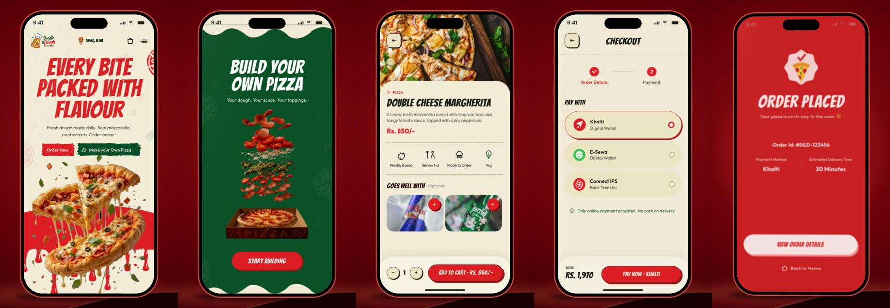
Replacing them: I asked the client for the menu and built from that. I generated every pizza image with Gemini and ChatGPT, then defined the colors, typography, and doodle language myself.
I put the result next to the guidelines version in a before and after. The client chose mine, and the guidelines were dropped.
The pivot
Then my own direction failed. There was no budget for user testing, so I showed the design to people in my own circle. One of them said: “It doesn't make me feel hungry.”
One comment was enough, because it named the only job the screen had. I'd gone deep on typography and color and lost the goal.
That feedback exposed it before anything was built. After it, I went back in and changed the imagery, the intent, the color, and the visual hierarchy.
“It doesn't make me feel hungry.”
Trade-off
I chose generated pizza images over waiting for a real photoshoot. It gave me speed and full control of the look.
It also means the pizza on screen is an idealized render, not a photo of what the kitchen makes, so what arrives at the door won't match it exactly. I knew that when I made the call.
Outcome
Build-your-own pizza became Doodle & Dough's primary USP, and the design gave users clarity. They understood it.
Conversion was 78% over three months.
Reflection
The pivot was a focus failure, mine. I polished what I could see and lost the point of the screen. Now I test every UI decision against one question: what job does this screen exist to do?
The four days were a speed failure. I sensed the guidelines were off as soon as I opened them, and I still waited for the client meeting to say so. Now I show the evidence the moment I have it.